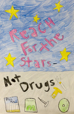
In one way or another, students will be asked to design posters for classes, presentations, contests, and a myriad of other areas of their lives as they get older. Some will be hand-drawn and some will be digital, but ALL will need a good sense of design. I decided this would be a good “life skill” to use as the focus of a project. When we started, our school-wide Red Ribbon Week was coming up and my students were offered an opportunity to create posters to be displayed, so this was the perfect time!
In doing some research to see what the graphic design experts say about designing posters, I came across this great article on thecreativebloq.com: (How to Design a Poster: 10 Pro Tips). Because I am working with upper elementary students, I trimmed it down to 4 tips and reworded it a little. Here is what I came up with:
1. Find a focus. What is your message? What do you want the viewer to see first?
2. Add a few details…but not too many. You want to include some fun and interesting pieces to the poster, but not so many that we lose your main message.
3. Balance the composition. This ties in with #2. Lay out all of the components of your poster evenly - no big blank spaces.
4. Mix your fonts. Use more than one letter style to give your poster a little more interest.
We talked through all of these guidelines and I modeled how to plan out a poster on sketch paper first. Then the kids went to work!
As simple as these ideas seem, we can refer back to this little graphic design lesson in other ways as we come across design challenges in future projects. I also may create a bit more detailed version for my older students, too.
Happy Creating!


No comments:
Post a Comment