Friday, April 1, 2016

Essential Questions in the Art Room


While the whole Essential Question thing has been a bit confusing, (sometimes I swear I’m hearing or reading conflicting information!) I finally feel like I’ve got a bit of a handle on the overarching essential questions in each of my classes.  I’m continuing to write the question(s) specific to each project, but these are a good start.  I know that online resources really helped me to write mine, so let me add to the conversation!

This will also be my last post this school year as I evaluate the writing of this blog and how it fits into the goals I’ve set for myself.  I’ve very much enjoyed writing, documenting and sharing a little bit of my classroom as I've learned about the blogging process. 


4th-12th GRADE  OVERARCHING ART ESSENTIAL QUESTIONS:

The important overall goals of my classes include: idea development and creative problem-solving, the development of practice and "stick-to-it" skills, craftsmanship, and self-expression. Hopefully these are covered in the essential questions.


4th/5th/6th:  ESSENTIAL QUESTIONS

How do we develop a good idea?

How do we make an artwork look complete?

How is practice an important part of learning anything new?

How does art help us tell people our feelings?


7th/8th:  ESSENTIAL QUESTIONS

How do artists grow and become accomplished in art forms?

How is art a form of communication?

Why is craftsmanship an important part of creating something excellent? 

How does art help us use our brains in a different way?


ART 1 / ART 2:  ESSENTIAL QUESTIONS

To what extent do artistic skill building activities help you express yourself?

What role does graphic design play in consumers' choices? (Visual Literacy Smart Goal)

In what ways can artwork reflect what is happening in a culture or society?

How can reflecting on your own work help you improve how and what you learn?


ART 3 / ART 4 / ART PORTFOLIO:  ESSENTIAL QUESTIONS

What role does persistence play in revisiting, refining, and developing your ideas?

How do artists appropriately use other’s images and ideas?

How does self-expression and creative problem solving help you in other areas of your life?


How do people engage in the visual arts throughout their lives and how do they benefit from it?


Happy teaching!

Tuesday, February 16, 2016

One Word for the New Year


Because we are on a block schedule, when we start our new semester of classes, its just like starting the year over; fresh and exciting, with new schedules and new students.  Its a great little boost to the school year, as you realize that these are the students you will be with until the year is over. 

I like to start the new semester with a warm up project for all 7-12th grade students.  Its very short and non-threatening, but it sets the mood for the class. We actually did this a few weeks ago, but it was a successful little beginning project and I wanted to share.

 For the last few years, instead of a New Year’s resolution, I have started the year by choosing a word I would focus on for the whole year.  It was generally something I wanted more of in my life, or something I wanted to work toward.  I decided this would be a great thing for my middle and high school students to do also.  They could focus only on the new semester, or, since it was only mid-January, they could use the word for the whole year. I showed them this video to give them word ideas.

 I asked them to create a small artwork around their word.  These pieces were only 4 inches square, so it did not take long, but it generated a lot of discussion within the class and gave us a little glimpse into each other’s minds and souls. (I shared mine also.)  I did not require them to explain why they chose their word, but many shared as they worked.  This is exactly the kind of class atmosphere I’m always trying to encourage, so it was successful on many levels.

I created a bulletin board with all of the finished works.

Projects like this are fun to display because they invariably make the viewer think…asking the question: “What would your word of the year be?” 


Happy Creating!


Tuesday, January 12, 2016

Getting Organized in the Art Room: Personal Kanban


Is one of your New Year’s resolutions to be more organized?  Well I have an idea for you!

Kanban is a visual signal that's used to trigger an action. The word Kanban is Japanese and roughly translated means “card you can see.” Toyota introduced and refined the use of Kanban in a relay system to standardize the flow of parts in their just-in-time (JIT) production lines in the 1950s. (http://whatis.techtarget.com/definition/kanban)  It helped everyone in production to see what was being completed and what still needed to happen. 

This interesting idea is most often used in the corporate world, but has also crossed over into other fields.  In education, it can be used in a group setting for committee work, collaborative projects, etc. or individually as a personal “To Do” list.  This second way is how I use it.

As an organization nerd, I stumbled across Kanban and have adopted it as my classroom to-do list.  It works really great for me because it limits what I am focusing on at any one time, so I don’t get overwhelmed.  It is also very encouraging because it reminds me what I have already accomplished.
If you google “personal kanban” you will find all kinds of examples and information.  It is highly adaptable to your needs!  An excellent website for further explanations and info is Personal Kanban
As stated in the above link, there are two basic rules:
     * Visualize your work
     * Limit your work-in-progress


There are several ways to draw up your Personal Kanban.  I
chose to use a manilla file folder and make 4 columns:

TO DO:  for all of those items you need to get done
TODAY:  for the things I either need or hope to get done        today only
IN PROGRESS (waiting):  for those things I’ve finished as      much as I can and I’m now waiting for a response or        action by someone else before they can be completed.
DONE:  my favorite!…used when something is completed!

Sticky notes are used for each individual task so they can easily move from column to column.
Every so often I clear off the DONE column and start fresh.  

What a satisfying way to keep track of the To Do’s in my teaching life.  Give it a try and see what you think!

Happy Organizing!

Wednesday, December 16, 2015

A Mixed Media Process


Teaching students mixed media can be daunting.  There are so many processes and techniques that can be combined in endless ways!  Sometimes it is paralyzing for students who don’t know what to do next or if they like the layer they’ve created and don’t want to “mess it up.”  I have many good books, websites and Youtube videos that give students info and ideas, but getting them to try new things was like pulling teeth!  

So, inspired by the book “Paint Mojo” by Tracy Verdugo
I created this layered mixed media project that walks students through the thought process of creating by giving them instruction, but also some lateral movements within the work for their own self expression.

Here are the instructions given to students:  

LAYER 1:  Choose 3 acrylic colors and paint a canvas board in blended patches. Add pieces of newspaper, phone book pages, dictionary pages (or another paper of your choice) and using Mod Podge, add them to the piece.


LAYER 2:  Design five or more “personal icons” (personal symbols) and make notes on what they mean to you.  (Put in sketchbook.)  Icons are then painted on and stamped on using pieces of styrofoam with the icon drawn into them. You may repeat icons as needed.


LAYER 3:  Add lettering in some way. (Make stencils and paint, find larger magazine words and attach, or research other interesting ways to add.) Putting a positive spin on any wording you add is a nice touch!


LAYER 4:  Finish up by adding whatever it needs to look complete.  This may be several layers or just one more…  Be creative and try interesting processes to come to an interesting, textured, unique mixed media piece.


Happy Creating...and Happy Holidays!!


Friday, November 20, 2015

Creative Photo Challenge


Isn’t it fun when you find inspiration in those random everyday activities? That’s how this project came into being…as I was scrolling through my Instagram and came across an account that Instagram had highlighted in their feed.  The name on the account was “superattractiveghettoblaster”  (interesting, right?) and the story behind the awesome photos was interesting, too.  French architect Thibault Ressy discovered 25 vintage boomboxes at a sale warehouse in Shanghai.  He and his friends used them as party props and then started shooting portraits of people throughout the city with the boomboxes.  Superattractiveghettoblaster was born!  The photos are beautiful, thoughtful, fun, peaceful and inspirational!  


After visiting this fabulous instagram account I asked students to choose an object of their own and take at least 20 different photographs in a variety of scenes with and without people.  The goal was to make each photo interesting on its own and as a part of a larger series.

To turn this assignment in, I asked students to go to PicMonkey, choose their best 9 photos, and create a collage using the “9 Square” under Collage Layout.  This collage was then saved and turned in to our Google Classroom account. This set up was an easy way for students to practice choosing their strongest images and it made it easier for me to grade, when I could see them all at once.


I was pleasantly surprised at how much fun students had with this project.  Most of them really got into it by just using the cameras on their phones, but a few borrowed the camera I have in my classroom (a simple 35 mm.)  They did any necessary editing in Picmonkey before creating their collages, but kept the original photos for use with future projects or competitions

Keep your eyes open for those interesting new ideas just waiting around the corner! 
Happy photograph-taking! :-)

Thursday, November 5, 2015

How to Design an Awesome Poster! (Elementary version)


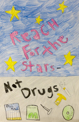
In one way or another, students will be asked to design posters for classes, presentations, contests, and a myriad of other areas of their lives as they get older.  Some will be hand-drawn and some will be digital, but ALL will need a good sense of design.   I decided this would be a good “life skill” to use as the focus of a project. When we started, our school-wide Red Ribbon Week was coming up and my students were offered an opportunity to create posters to be displayed, so this was the perfect time!

In doing some research to see what the graphic design experts say about designing posters, I came across this great article on thecreativebloq.com: (How to Design a Poster: 10 Pro Tips).  Because I am working with upper elementary students, I trimmed it down to 4 tips and reworded it a little.  Here is what I came up with:

1.  Find a focus.  What is your message?  What do you want the viewer to see first?

2.  Add a few details…but not too many.  You want to include some fun and interesting pieces to the poster, but not so many that we lose your main message.

3.  Balance the composition. This ties in with #2.  Lay out all of the components of your poster evenly - no big blank spaces.

4.  Mix your fonts. Use more than one letter style to give your poster a little more interest.

Here's a little graphic for you: 


We talked through all of these guidelines and I modeled how to plan out a poster on sketch paper first.  Then the kids went to work!  


As simple as these ideas seem, we can refer back to this little graphic design lesson in other ways as we come across design challenges in future projects. I also may create a bit more detailed version for my older students, too.  

Happy Creating!

Thursday, October 22, 2015

An (Almost) Free Standing Desk

Have you seen the research on the use of standing desks? If not, check this out More focus, better health, more energy, etc, etc!

I tend to roam the room with my younger classes (and they have more needs and questions) than with my high school students.  I try to check in on them every 15 minutes just to make sure they are on track, but I do not like to hover (as discussed in this post) which means I like to work at my desk along with my students.


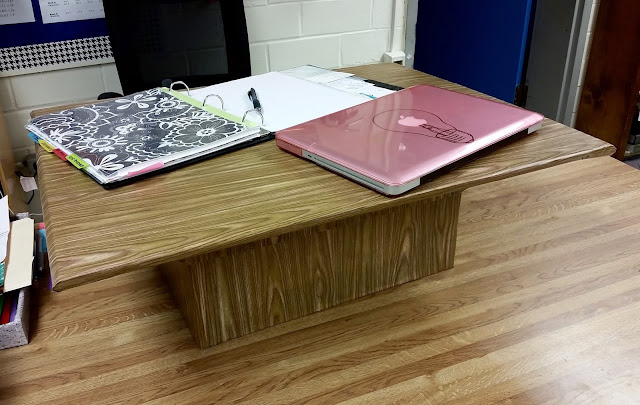
So I decided to try the “standing desk” craze.  After doing a little research and looking at costs, I figured out a way to make one for (almost) FREE!  


A couple of random boxes, some hot glue and some wood patterned Contact paper ($4) and VOILA!  A standing desk of my own!  My students enjoyed teasing me (“WHAT are you making?”), but the work space size is perfect, the height works well and I really like it!  As I was explaining this concept to questioning kids, they said…”You mean like a podium?” Yes - I know its like a podium, but I do NOT have room for one more piece of furniture in my room!  This baby is portable, can be easily set aside when I want to sit at my desk, and it works great!

I wrapped the bottom and top separately so that I can still use the box if I want to.  Right now, I have a couple of books in there, just to give the base a bit more stability.  


I’m considering making more of these for students in my room who would enjoy working standing up.  How fun is it to make something out of (almost) nothing?


Happy Creating!

Friday, September 25, 2015

Design Your Own Shading Style


Hello again! Summer is over and we’re finally back into the swing of things! My Art 4 students, by this age, are often tired of the same old, same old shaded drawings so I’ve recently been challenging them to come up with a new way to shade.  If you google “scribble shading,” the variety of ideas that come forward are amazing.  
by Vince Low

I’m especially a fan of Malaysian artist, 
Vince Low and his celebrity portraits.
Here is a great video demonstration of what he does.

(And here is another inspiring video that could tie in with this project:  
Embrace the Shake!)

To get students warmed up, I asked them to design a few different “styles” of scribbling or mark making.  They could then choose whichever one worked best for their chosen photo.

The trickiest parts of this project were controlling the values (the buildup of marks takes patience) and getting the smallest details defined as best they could.  Sometimes, simplifications were in order.  

Students complained at first, but once they got the hang of it, they did well and the artworks were created surprisingly quickly!  Yeah for techniques that are easier than they appear!!


Happy Scribbling!


Friday, May 22, 2015

I DID IT! One Artwork a Day Challenge


I know I said I was done blogging for the school year, but I just had to share this...I DID IT!  With the encouragement and interest of my awesome students, I created one new artwork per school day for the whole school year (as referenced here and here.)  Some of them are not great...and others have inspired me to create a larger piece exploring an idea further. 

The kids and I had some awesome discussions centered around this endeavor and if nothing else, showing them how to set a goal and work to achieve it, even when inconvenient and difficult, was a good thing. I also learned, for myself, that you have to create through the good ideas and the bad ones. If you just keep going, your voice, your muse, your inspiration comes through; definitely a message for me to remember! 
Once again...Happy Summer!

Monday, May 11, 2015

Using Evernote for Art Portfolios


At the end of the first semester this year,  I shared my LOVE of Evernote  (tutorial links in that blog post) with my advanced high school art students and showed them how fabulous it could be to help them stay organized when they go off to college in the next year or two.  
I also showed them how awesome it can be as a place to store their artwork by asking them to create a student Art Portfolio and write an analysis of their work this year.  They had to include this year’s work, but I also gave them the option to include work from other years and many of them added work from 7th grade on up! (Don’t you LOVE those kids who keep their work from every year of Art??  Makes my heart happy!)
View of the online version of Evernote

To get their work into Evernote, I gave them tips on photographing their work and enhancing those tired photos in iPhoto.  We kept it simple by asking them to crop it to the image, and hit the “wand” to enhance color and value.  

In their analysis I asked them to talk about where they could see growth in their artwork and what areas they still needed to work on.  This analysis was written as a separate “note” in the Student Portfolio “notebook.”  

STUDENT ART ANALYSIS SAMPLE...

Once they are done, they just "share" it with me by emailing me a link to their notebook.  I can then download it into my Evernote account.  

It has been so eye opening to see how far they have come and to read their remarks and comments.  They are typically hard on themselves, so it was great for them to witness the progress they continue to make with their skills and creative vision.  

View of the downloaded Evernote desktop app

Another nice part of this setup with Evernote is that it automatically goes with them when they graduate.  Other programs that are tied to school accounts make it hard to take all of that work with them when they leave.

Once students have done this once, they can just keep adding to it from year to year. I plan to make it part of the "end of the semester" routine each year.

This will be the last post before we wrap up the school year.  
Happy Summer everyone!!  See you in the fall!! :-)